Paula Scher
I particularly enjoyed working in the style of Paula Scher as the colours and layout she is known for, is something I admire and have incorporated into my own private techniques. Her iconic designs have been popularised all over the world, with the eye catching imagery making her one of the most well known graphic designers.
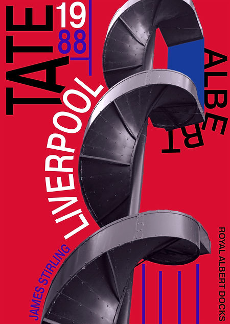
To achieve a similar effect, I used images I had taken at the Tate in Liverpool and with the selection tool, cut out specific areas, to then place them over a bright solid colour which I had surrounded by text and shape, to mimic that of Paula Scher's.
my favourite design; as suggested on the Architecture page, is the red and indigo piece. I like how I arranged the 'Tate' text on an angle and modified the length to enclose the 'O' from the Liverpool text.
You can see some of her designs in the slideshow and my designs below.


